ArtWorkPlay with Kenny K: "The Gift Grab Game" (Miner Products)
by Kenny Kiernan | 29 Jun 2021
Industry Commentary, Op-Ed
Creating illustrations, characters and packaging for the toy industry and loving it! ArtWorkPlay with Kenny K is about sharing insights, WIP pics and anecdotes with collaborators from past projects in order to de-mystify the process a bit, and shed some light on how it's done!
The Gift Grab Game ®
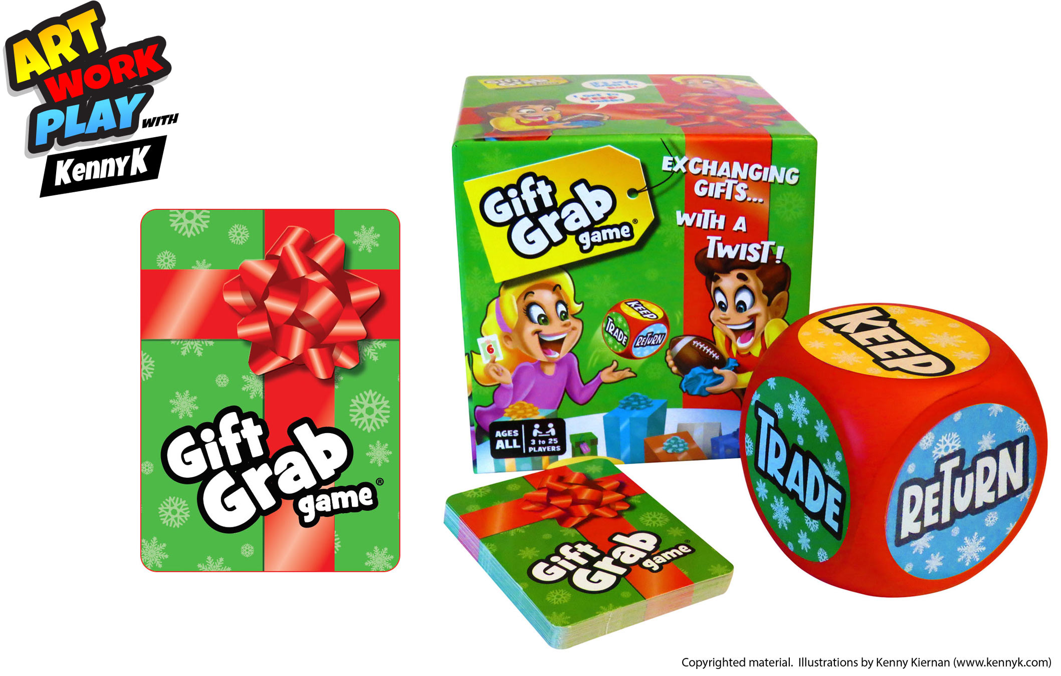
The project: "The Gift Grab Game" packaging & components design & illustration
Client: Miner Products
My guests and co-conspirators: Todd Miner (Miner Products) and Herschel Glueck (Hero Time Manufacturing)
KK: Gentlemen, thanks so much for contributing to this post! It was great working with you both recently on The Gift Grab Game. Todd, I remember our early discussions for the project centered on how to best translate the game and components into the new format because it had already been on the market with different packaging, correct?
Do you have any advice/insights to share with any readers that may be considering upgrading their own products that are already out there? I remember you already had a pretty solid idea for a non-traditional box, and what was to appear on the main front panel.
TM: That's right, the original packaging was a thick canvas drawstring bag with the game logo printed on the front (pic directly below). I wanted something that stood out from other games. I was inspired by “Bananagrams”, which uses a unique bag shaped like a banana. It worked great for selling online, but when I received my first brick-and-mortar store order, I quickly realized they didn't display or stack well at all.
That's when I began thinking of a new package design that was still unique, but was more “shelf friendly”. Since the game is for Christmas gift exchanges, I wanted the box to look as closely as possible to a wrapped gift. Making the box cube shaped with a bow on top and ribbons streaming down the sides made perfect sense.
My advice to others for product packaging is to come up with creative, unique packaging that really stands out from other similar products on store shelves up front. Even if you think you're only going to sell your product online or will to start, consider how your product will look on store shelves to avoid the need to redesign your packaging later.

KK: I recall that we went through a few versions of the front panel. The original idea we discussed made total sense but once we put it together, given the size of the box and the "gift box with ribbon" theme, we realized that our first iteration was way too busy. So we had to go through I think several iterations of stripping things away before arriving at the final version.
TM: I absolutely LOVED our original version of the front panel. You did an amazing job of integrating multiple elements to make the front panel look like a large group playing the game in a living room. It included silhouettes of players in the background, wallpaper on the walls, lots of gifts on a table, and even a beautiful Christmas tree in the corner.
I was ready to start manufacturing but after Hersh sent over the first samples, I realized many of the elements weren't recognizable from a short distance away since the sides were only 5x5x5”. As painful as it was, after we stripped away some of those elements, the main characters stood out better and the idea behind the game became clear.
The lesson learned from that experience was to either get samples or print out 1:1 prototypes early on when designing the packaging artwork so changes can be made based on what it will look like in real life, not just on a computer screen.

HG: From the manufacturing point of view, there were a few iterations and considerations. The first was glossy vs. matte lamination. We printed the box sample twice to compare the two, and the glossy definitely had an advantage as it made the colors brighter and more attractive. The box's theme was very lightweight and fun, and we felt that the glossy lamination added so much to the art.
Second, we had in mind to add a red foil stamp on the ribbon around the box, so it becomes even more apparent and resembles an actual ribbon. However, if we were to make the foil-stamped ribbon, we would have had to clear all text and images from the ribbon to keep the foil stamp from hurting the overlaying art and text. After considering the overall layout of the art on the box, we concluded that it wasn’t worth it.
A third iteration that I remember clearly was that of the words on the bottom of the sides. As there is a natural gluing margin of 3mm, it could have happened that the words will be cut off. So, we had to revise that part on the box and eventually deleted the words at the bottom of the box entirely.
A fourth iteration for the game were the larger numbers on the cards. When converting the art to print, the white border of the numbers connected to the white around the gift box background, and it did not look good. So we had to change that part and make the numbers a little smaller.

KK: Hersh, I was included on some of the communication between you and Todd, but I believe there was some back-and-forth between you two regarding certain technical issues or other before some decisions were made that were then passed along to me. Anything useful or interesting here that you'd like to share?
HG: Yes, there were a few things to consider when making the box. The first was because of the height of the two-piece box, we needed to make sure that there was enough space between the top and bottom parts of the box. The usual 2mm difference wasn’t enough as the friction between the two pieces covered a larger area and made it more difficult to separate the two.
Second, and this we learned after the fact, as the box is the shape of a cube and not flat like standard packaging, there was a lot of wasted air volume in the shrink wrap, and it caused the shrink wrap to either tear or have a thick seal line. Eventually, we had to revert to using transparent stickers to seal the box, as we did not want the shrink wrap to take away from the outstanding art. In hindsight, we could have also positioned the seal line of the shrink wrap in a different position of the box, maybe top to bottom instead of right to left.
Third, we considered making the box with a 2:8 ratio of the top and bottom, instead of the traditional 8:8 ratio where the top part covers the whole of the bottom part. Still, in the end, we felt that the standard 8:8 box would be more suitable here as the lid is tighter and will keep the game safer.

TM: Other than the issues Hersh already mentioned, we also discussed box materials and thicknesses in detail. There were some other options for box materials that we considered. Most notably, we almost used a tin metal box instead of cardboard. The lid could either be connected to the box with a hinge or separate. Hersh got some quotes but it became obvious that it was too cost prohibitive to use metal versus cardboard. Even though it's a lot of fun brainstorming different packaging options, cost always has to be a consideration, especially for a brand new product.

KK: Love that big squishy foam die! Can you elaborate a bit on what's involved with adding a component like that into the mix, seeing as the rest of the pieces are printed cardboard items? Also, isn't there a fitted custom plastic tray in the box as well?
TM: Ah yes, the dice! The first version of the game included a giant die made from solid cherry wood. It took FOREVER to find a manufacturer who could produce them at a high enough quality and affordably. Even after finding a suitable manufacturer, there were a ton of issues with painting and printing the artwork onto the sides.
The first year I sold the Gift Grab Game, I got feedback from customers that the die was too hard and they felt like it might damage their tables or floors when rolling it. That's why I decided to change the die material to something softer. I found a PU foam supplier that made high quality foam products and forwarded their contact info to Hersh who then took over the communication and negotiations with them when including them into the manufacturing plan. Changing to foam was the best decision I made with the Gift Grab Game. Now, the die can be easily rolled, tossed, thrown, bounced, or even spun safely on any surface.
To my surprise, the insert has been the biggest challenge and it's not even a game piece! Hersh and I considered using different types of plastic and foam in different colors and densities. Cost varied greatly between them as well. The challenge was stretching the plastic enough to accommodate the large die while not getting stretched too thin. It's actually a challenge still to this day- there is a high rejection rate for substandard inserts.

HG: One of the great things about manufacturing in China is having everything within reach. Todd was the one who found the PU supplier for the dice and already got a few samples from him. There was a debate at that point on whether to print directly on the PU material or print on a sticker and then glue the sticker on the dice itself. It came to be that printing on a sticker is the better solution as the print will last for longer, not peel off easily, and lastly will look a lot more vibrant. Printing on the PU material itself dulls the colors.
One thing to consider in PU is the margin error in size, which goes up to 0.8cm. We ended up with over 300 dice that did not fit into the insert properly. Another consideration for the dice was using PU vs. EVA. EVA is also foam, but it is hard and not that squishy. Though it would have been cheaper and easier to use EVA, Todd wanted a great user experience and decided to use the PU.
The plastic insert was also a challenge. The dice is 7cm, which means the insert ideally should have been 9-10cm deep. This turned out to be too deep for the plastic insert to stay firm. The insert is made by putting a hot sheet of plastic on a mold which causes the plastic to stretch in certain areas. That depth in ratio to the width and length was too much for the standard thickness plastic sheet, and we had to use an extra thick one. Even with the extra piece insert, we didn’t always get the ideal result, and we had to recycle over 500 inserts.
KK: I believe the idea was to get the product on the market in time for the Christmas season, of course! Todd, did you achieve that goal? How did we do overall with timing, based on your original plan?

TM: Yes, unfortunately we weren't able to get the new version on the market before Christmas 2020. But fortunately, I still had a few hundred of the original version still available. Since the Gift Grab Game is a game played in groups, I was afraid I wouldn't sell many duing the Covid pandemic. However, I was pleasantly surprised when they sold out quickly just before Christmas 2020. But at least now I have plenty of stock for Christmas 2021! Not only will they be sold through only Amazon as they have been in the past and are currently, I will be selling to more stores and catalogs as well.
HG: Due to the challenges we faced in production, we managed to get the games out just before Christmas; if I recall correctly, it was around December 10th or 15th, when the final version of the game was ready for sales in the US. This did not leave enough time to establish marketing campaigns and logistics channels. Luckily, Todd had a few of the previous versions he decided to sell off that year and issue the new version for Christmas of 2021.

TM: When it comes to packaging, I would love to pass on these valuable tidbits that I learned which may help others avoid the pitfalls I fell into.
a) Get the best artwork designed as possible. Most of the time, customers make purchasing decisions based on packaging alone. I've seen some amazing products wrapped in hideous artwork that looks like it was made using clipart and PowerPoint.
b) Work together closely with your designer, manufacturer, suppliers, etc. Remember, you're working with other humans who have feelings, personalities, and families, not robots. Play nice and have lots of patience- you are not their only client. I consider Kenny and Hersh to be integral, valuable team members.
c) Think of how the CUSTOMER will view your product. Your personal opinion really doesn't matter much since your customers are the ones making the decision to purchase your product. Do some market research, get lots of opinions from others outside friends and family, and be prepared to choose green even if YOU prefer blue.
Thank you for this opportunity to share some back-and-forth about the history of the Gift Grab Game, Kenny! I want to develop a new product just so I can continue working with you and Hersh!
HG: The main conclusion we got from this project was that we have to work with the game creator hand in hand, and patience is vital in this area. Todd was excellent throughout the whole project, understood the issues, and worked together to decide ways around them. Overall, I felt that we worked together as a team rather than just creator VS manufacturer, which is the main reason this project was successful.
KK: Totally agree about patience and maintaining one's cool during the inevitable stressful periods. I never knew about a lot of these issues; both of you were consistently professional and easy to work with the entire time, and that's something I always make a point to do as well.
A lot of interesting and valuable info here guys, love it! Thanks so much for taking the time to contribute - let's do more stuff together!
___________________________
The Gift Grab Game is currently available through Amazon
(https://www.amazon.com/gp/product/B07L22FC3Q).
More information (and a demo video) can be found at www.giftgrabgame.com.
Todd Miner is the founder of Miner Products, creator of the Gift Grab Game, serial entrepreneur, PCB designer, and proud USAF veteran. He can be reached at todd@minerproducts.com or through LinkedIn (https://www.linkedin.com/in/todd-miner-056820183/) or Facebook (https://www.facebook.com/GiftGrabGame).
Hershel Glueck is the owner of Hero Time Limited, the first foreign-owned factory in China to deal with board games exclusively. Hero Time manufactures and assembles all printed components in its location and has a sourcing team for other unique and custom-made pieces that complement your game. You can learn more at www.herotime1.com or contact Hersh at hersh@herotime1.com
Kenny Kiernan Illustration & Design Studio specializes in the toy & game and children's market, delivering top-quality work for 20+ years for mega-brands (Hasbro, Mattel, Disney, Marvel, Spin Master, LEGO, Scholastic, more), as well as businesses of all sizes, and creating concept art for inventors and product development. Check out www.kennyk.com for lots of samples of Kenny's work and available services. Connect with Kenny here on POP and onLinkedIn
Related Product
Recent Blogs
Recent Blogs

General
McHALE DESIGN CASE STUDY: MONSTERVERSE- THE LEGEND CONTINUES…

General
Build-A-Bear Celebrates National Teddy Bear Day with Donation to The Toy Foundation™

Industry Commentary, Op-Ed
Toy Foundation Auction is Now Open for Your Bids

Industry Commentary, Op-Ed
Bracelets, Stickers, and Viral Fame: The Story Behind Sky Castle Toys’ Sticki Rolls

Biographies and Interviews
Chrissy Fagerholt: Luck is when Preparation Meets Opportunity!
See more
Recent Wiki

BOOK REVIEWS
Book Review: Storm: Dawn of a Goddess by Tiffany D. Jackson

BOOK REVIEWS
Book Review: Erno Rubik and his Magic Cube by Kerry Aradhya

BOOK REVIEWS
Game Review: Trip Chaser

COMPANIES
Learning Express Toys Hosts 25th Annual Convention & Toy Expo at JW Marriott Tucson

MISCELLANEOUS
Submit Your LA Showroom Details for 2025 Toy Previews
See more
POP's Got Talent

POP Entertainment
Randy Klimpert Shares his Ukulele Collection
POP Entertainment
Steve Casino Peanut Art
POP Entertainment
Everyone's Talking about POP!
POP Entertainment
Princess Etch - a Multi-Talented Etch A Sketch Artist

POP Entertainment
Joseph Herscher of Joseph' s Machines.
See more
Recent POPcast

Hidden Role: The Brains Behind your Favorite Games
Connie Vogelmann designed Apiary & Wyrmspan!

Hidden Role: The Brains Behind your Favorite Games
Bob Fuhrer... Is THE Crocodile Dentist!

Hidden Role: The Brains Behind your Favorite Games
Tom Dusenberry... Bought Atari, Wizards of the Coast, and Avalon Hill!

Hidden Role: The Brains Behind your Favorite Games
Matt Leacock created Pandemic... the game!

Hidden Role: The Brains Behind your Favorite Games
Scott Brown and Tim Swindle... are Launching a New Sport!
See more
POPDuos

POPDuos: Interviews with Legends and Leaders
POPDuo: Richard Dickson, Mattel’s President & COO, and Kedar Narayan, Young Inventor Challenge AMB

POPDuos: Interviews with Legends and Leaders
POPDuo: Will Shortz and Josh Wardle

POPDuos: Legends and Leaders Explore Creativity
POP Duo: Elan Lee, Co-Founder, Exploding Kittens.and Jeff Probst, Host and Exec Producer, Survivor

POPDuos: Legends and Leaders Explore Creativity
POP Duo: David Fuhrer, MNG Director, Blue Sq Innovations & Shawn Green, past Dodgers & Mets MLB Star

POPDuos: Legends and Leaders Explore Creativity
POP Duo: Bob Fuhrer, Founder, Nextoy and Tom Fazio, Golf Course Designer
See more


